CASE STUDY
NordicTrack product pages
Heading in to the 2022 sales season, NordicTrack was wanting to update their product pages to better communicate the iFit (interactive fitness) subscription experience. With the hope of using the iFit story to boost conversion.
This was primarily a solo project under direction from the CEO. I was the principal UX/UI designer, copywriter, image editor, and creative strategist throughout the project…in addition to my other responsibilities, haha.
*Namaste…let’s dive in.

A treadmill with a twist.
.01Unique challenges
Presenting the iFit narrative in a way that didn’t diminish and distract from the product itself.
Avoiding brand confusion with both NordicTrack and iFit occupying the same page.
Creating a design template that could be used throughout the website on all products.
Work within development constraints—in other words, keep it simple with minimal backend work. Any new interactive or animation components had to be taken from existing elements on the website.
The current designs were a little chaotic in their structure, actually presenting text blocks as an image rather than coded into the site—something that needed to be addressed for SEO if nothing else.
.02My process
Collecting and reviewing current analytics from the product pages to measure against and discover drop-off points.
Competitive research, brushing up on best practices and points of differentiation.
Wire-framing, lots of grey boxes to focus design reviews on narrative and structure rather than design details.
Review and revision, review and revision, review and revision.
High-fidelity designs, mobile & desktop, and asset creation.
Creating handoff documentation, including animated prototypes for the dev team to reference.
What I started with.
↓
.03Solutions
Though the bar was admittedly low in some areas, the task was nonetheless big. The sales team was understandably cautious in approving any moderations to the existing page (not messing up what worked in the past) so I decided to sell the transition from a product centric to an experience centric design.
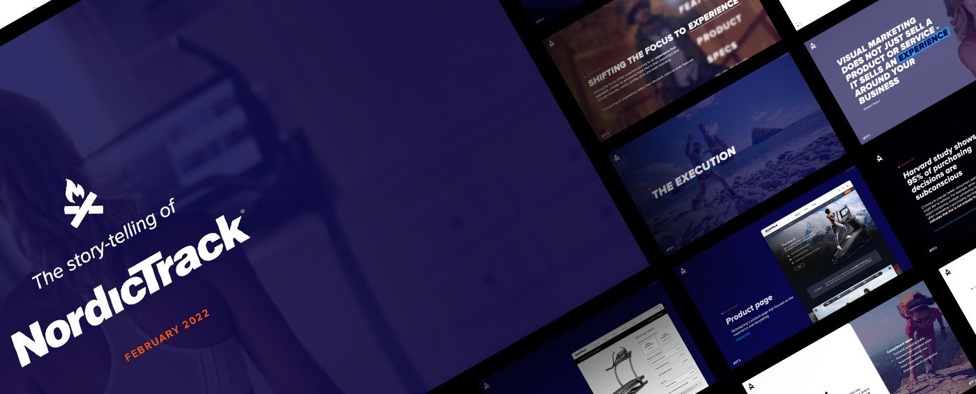
I ended up creating a pitch deck to promote the idea of experiential marketing.
Selling the experience.
↓
Through the design process the idea of “dark world” emerged, presenting the product in a premium environment and, more importantly, having the screen and iFit experience stand out in contrast to the background.
I discovered the the only main difference between most of the product categories was screen size—so rather than creating separate pages for each sku, I paired up the products together on a single page, adding a simple screen size selector as a beginning option.
.04The final narrative
We ended up with a successful integrated story-line, telling and showing the iFit experience without sacrificing showcasing the product itself. The structure went like this.
Product gallery—including price, primary features with iconography, main callout, CTA and screen selection. Providing enough information above the fold for comparison and purchase.
Industry validation, showcasing review snippets.
The iFit modalities of workouts, with videos auto-playing.
What I dubbed the “sexy beast” section, with minimal text and heroic images. The purpose being to highlight the quality and features of the machine.
iFit trainers, with profile briefs.
Since the display is the primary feature of the products, I created a section just for that and the sound system, with an overlay animation.
Callout section to callout distinguishing features with big bold text.
Cards to highlight secondary features of the iFit experience.
Reviews and social validation.
Product specs & details.
What we ended up with.
↓
.05Results
A/B testing against current designs showed an increase of conversion significant enough to roll the template out to the entire product line, resulting in hundreds of thousands of dollars in additional revenue. The “dark world” motif was also used for universally for later sales campaigns and marketing material.
.06The team
It’s always a group effort.
Though I mainly tackled this project solo, I am grateful to the executive team for the trust and flexibility they gave. Also a shout-out to the NordicTrack web development team for their quick responses and feedback.
Overall it was a fun and challenging project.


