CASE STUDY
iFit in-workout
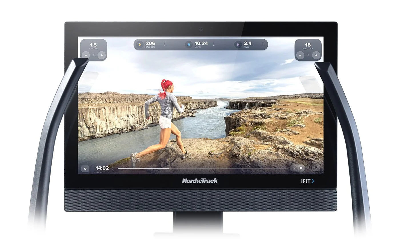
The in-workout experience is the most critical element of the iFit embedded application—housing a massive amount of real-time data, interactions that need to account for a user in-motion, while at the same time creating an immersive video training experience.
I was tasked with redesigning of the metric presentation, reducing clutter, testing and repositioning the mini-chart.
*Big stretch…let’s dive in.
.01Unique challenges
Complexity of the interface. This single application had to accommodate over 100 sku’s, 7 product categories, various screen sizes from 10 to 32 inch, several workout types from video, to maps, to manual, in additional to individual user preferences. Going in I had to be aware of and account for all the variables, miss one thing and you have to start over—*where’s my ibuprofen?
Addressing metric clumping causing too much cognitive load.
Designing for users in motion—running, walking, skiing, rowing, hiking, cycling…drinking coffee on the treadmilling.
Delivering designs that required options for little to much development time.
Expedited time frame—cue energy drinks and late nights.
.02My process
Collected and documented qualitative data from heavy users of the product, including internal executives (who used the product) with regards to wants, preferences and frustrations.
Researched the competition.
Built high-level wireframes, both digitally and old school pencil & paper (a lost art).
Designed in hi-fidelity.
Prototyped the basic interactions that we could install on the equipment for real life testing.
User testing, filming natural interactions and interviews—testing preference, ease of interaction, time to accomplish task given.
What I started with.
↓
.03Solutions
I presented three solutions to the executive team, each requiring more or less development time.
Option one.
The most basic option (requiring the least dev time) was just moving the mini-graph to the bottom of the screen, cleaning up and adding separation from the primary data sets. Other, more subtle visual modifications were added, including presenting the workout graph with actual data, reducing the opacity of the metric bar and adding a simple progress bar, emphasizing time left (important when you are sweating and huffing away).
Option one.
↓
Option two.
The most basic option (requiring the least dev time) was just moving the mini-graph to the bottom of the screen, cleaning up and adding separation from the primary data sets. Other, more subtle visual modifications were added, including presenting the workout graph with actual data, reducing the opacity of the metric bar and adding a simple progress bar, emphasizing time left (important when you are sweating and huffing away).
Option two.
↓
Option three.
The most radical of the options, I redesigned the header bar adding hierarchy between the running (pun) metrics and the control metrics (speed & incline), beefing it up making interactions easier for users in motion. I brought back a historically preferred “metric bucket” so users could change the metrics shown with a simple tap.
Separating the speed and incline metrics from the running metrics and giving them more space, provided room to add interactive “quicks” for machine control.
A bonus in this layout was designing side drawers for both the settings and widget tray selection, with access buttons equally placed in the lower corners, simplifying and adding interactive consistency to the design.
Option three.
↓
.04Results
This is a project that is still in development awaiting release. Due to development constraints option one was approved though option three was the winner of testing. We were able to do ample user testing though to ensure an improved in-workout experience and building it in a way that allows for easily integrating new and novel features.
.05The team
Props to my design team for adding feed-back and helping conduct user testing sessions. Also a big thanks to the executive team for approaching this project as users.


