CASE STUDY
NordicTrack checkout
I was the lead UX & UI designer on redesigning the NordicTrack checkout—improving conversion for both the product and the iFIT Subscription, a company generating $1.4 billion in annual revenue.
With the majority of revenue generate online, any improvement in the checkout experience could lead a massive return, both in diminishing abandoned carts, simplifying the process and integrating iFIT more seamlessly into the checkout flow.
*Cracks knuckles…let’s dive in.

.01Unique challenges
While there were some obvious and apparent things that needed to be address just to bring the checkout up to best practices, iFIT was the wild card. It was a secondary brand that wasn’t communicated obviously on the website.
An additional requirement of the project was to figure out how to collect credit card information for customers who select the financing option. Without that iFIT couldn’t bring customers into their subscription platform easily, making setting up recurring payments problematic.
Making everyone happy. With so many hands in this pot, I had to make sure that I didn’t disrupt the things that were working, creating both visual appeal, designing something that our internal dev team could actually build & test & iterate, in an expedited three week window of time, and be able to “sell” it to executives.
.02My process
Buy a case of RockStars.
Gather analytics, drop-off points, current performance and any previous testing and research.
Talk more in-depth to senior exec’s, both to collect their views, but also to help validate their perspectives and help with the “sell” at the end.
Competitive analysis, really viewing competitors and other e-commerce analogs for best practices and unique solutions.
High-level wireframes and simple prototypes, grey ugly intentional boxes. Intentional because adding any aesthetic elements distracts from the story-telling and flow—useful in focussing feedback reviews.
Design & iteration. Causing as little disruption to the current flow as I could, and working closely with the dev & sales team, we tested an iterated on the new design prior to launch.
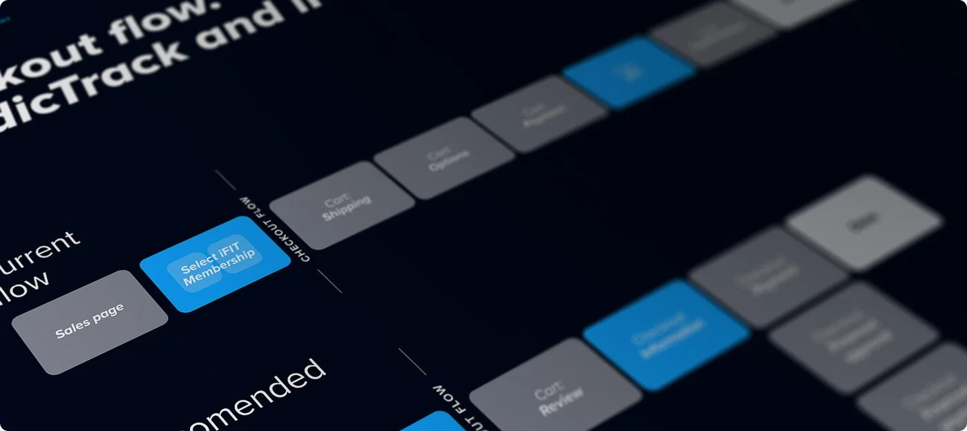
What I started with.
↓
.03Solutions
Easing the presentation of the iFIT subscription.
Dual branding is a challenge in itself, often leading to confusion and diminishing trust. I suggested they integrate iFIT into the header, secondary to the NordicTrack logo, presented in a simply typeface to establish hierarchy.
Reducing the steps to purchase.
Rather than forcing the user navigate to separate pages for warranty, iFIT and delivery selection I consolidated and simplified it all into a simple side drawer—prioritizing the most user relevant information. This was particularly valuable in presenting iFit as a standard option, clearly communicating it was ”interactive personal training”, while offering an upgrade selection.
Credit card collection for customers financing.
*Note: Honestly, I am proud for creating this unique solution, though I emphasize I didn’t feel comfortable with it unless transparency was a priority. Something I had to fight a little for with management.
My solution was to add in a transaction fee of several dollars for customers choosing to finance, credit card required, with clear text that their credit card would be saved for future subscription renewals.
Added FAQ’s to the cart.
I was surprised to not already find this. I added a simple FAQ’s to the cart, primarily addressing common questions regarding iFIT.
Other improvements.
I made the copy more approachable, less corporate.
What I ended up with.
↓
.04Results
By streamlining the checkout flow and introducing iFIT more tactfully we were able to reduce abandoned checkouts, especially at the point of introducing iFit, increasing revenue.
.05The team
Even though I was the solo designer on the project I couldn’t have completed it without the feedback of my design team, the trust of the executives and the sales and dev team who were incredibly responsive and who saw the vision.

