Checkout wasn't the problem. Confidence was.
NordicTrack read its checkout as a conversion problem. It was a confidence problem. Redesigning the purchase flow, the membership model, and the product page carried 44% of iFIT's $1.7B in hardware revenue.
Seven checkout steps weren't the problem. Seven chances to hesitate were. Nobody abandons a $3,800 treadmill because the form is long. They abandon it because every screen raises a new question, and this one treated iFIT, the actual reason to buy, like a stranger's upsell.
I reorganized the purchase around confidence instead of configuration. Answer each objection the moment it surfaces. Price the machine as a monthly decision. Don't bill for something the customer hasn't touched yet. The screens were the evidence, not the argument.
Conversion improved after cutover. 44% of iFIT's $1.7B in hardware revenue now flows through this path. I wasn't assigned the project. I wrote the proposal that became it.
The problem
Everyone read the checkout as a conversion problem. Fix the funnel, lift the number.
It wasn't. It was a confidence problem.
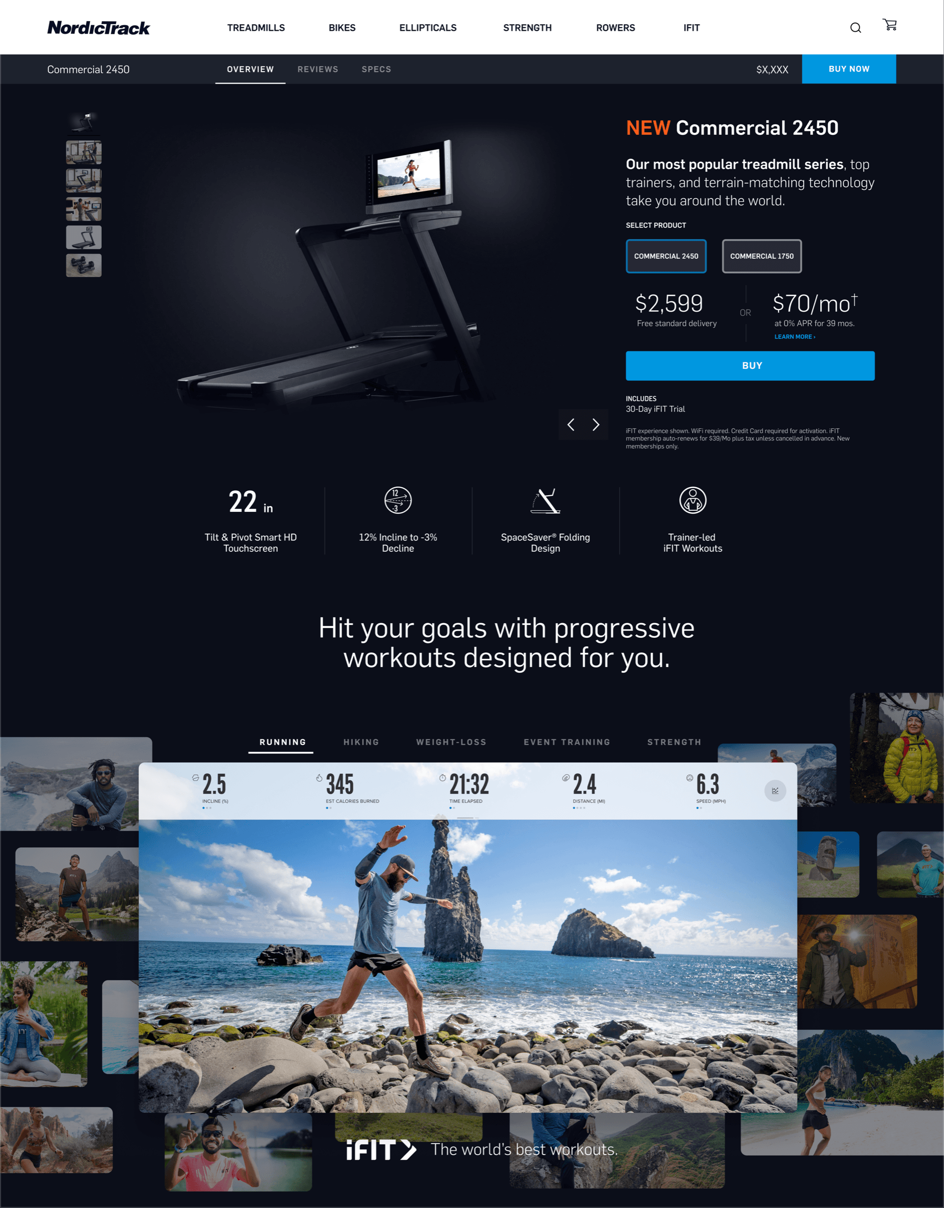
You were about to spend $3,800 on a machine you'd never touched, and the flow spent that entire moment making you less sure. Seven steps. A forced membership gate before you could configure anything. iFIT bolted on like a third-party upsell instead of the reason the treadmill was worth the money. And the subscription clock started billing the day you ordered, weeks before the thing showed up at your door.
Every one of those is a small withdrawal from an account of trust that's already low when the number is that big.
The model
2021. I wasn't on the NordicTrack DTC team. But I'd been watching the funnel.
So I made a deck. Not a request. Just the deck.
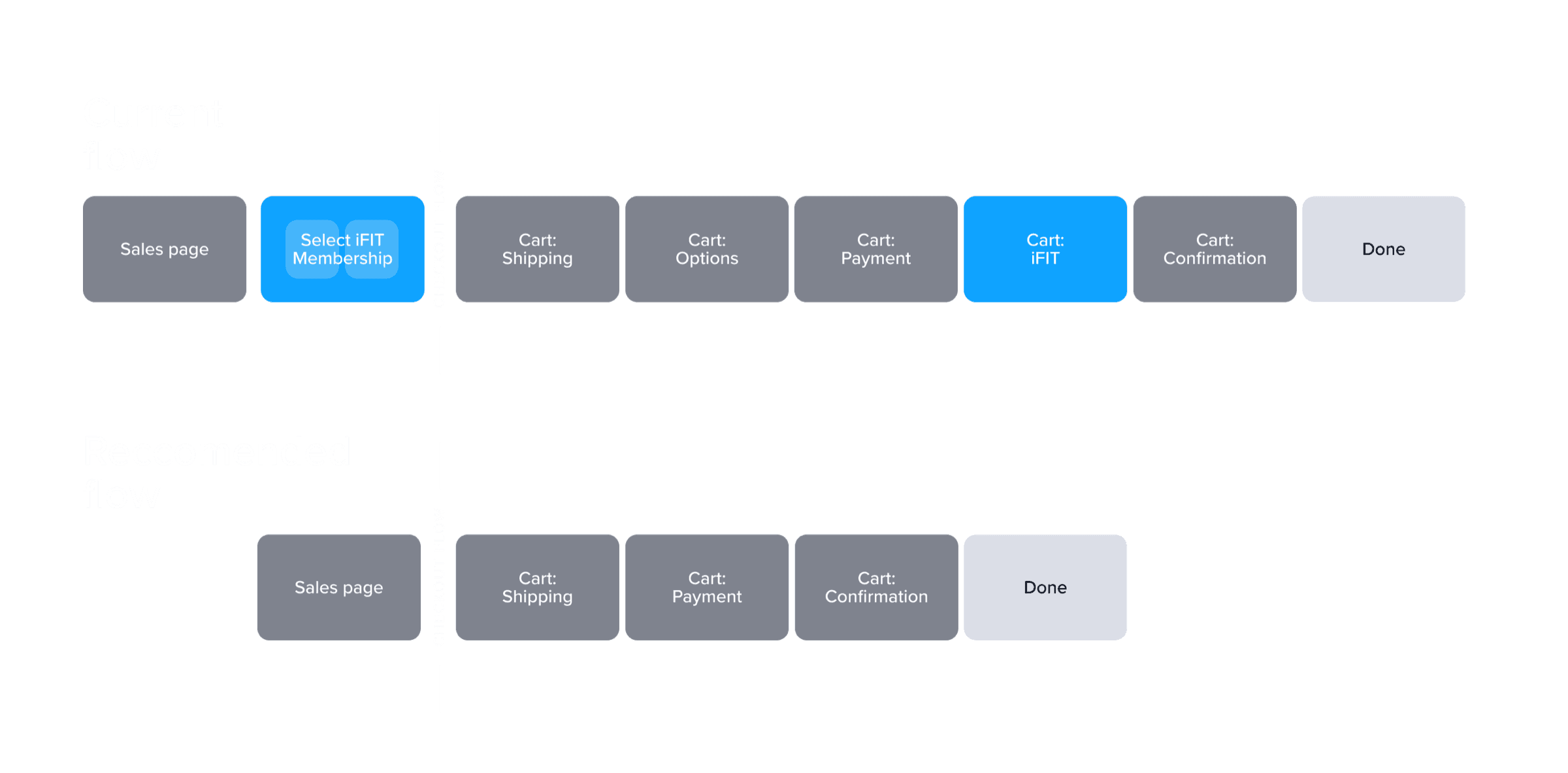
Current: Sales page → Select iFIT Membership → Cart: Shipping → Cart: Options → Cart: Payment → Cart: iFIT → Cart: Confirmation.
Recommended: Sales page → Cart: Shipping → Cart: Payment → Cart: Confirmation.
Three screens gone. The forced membership gate died. Two cart screens collapsed into one page you could actually configure. The deck opened with one line: simplify without abandoning the marketing, and lift from the competitor patterns that already proved what converts.
Leadership read it and put me on the project.
The work
Six moves. Every one of them answering the same question the buyer never says out loud: am I about to regret this?
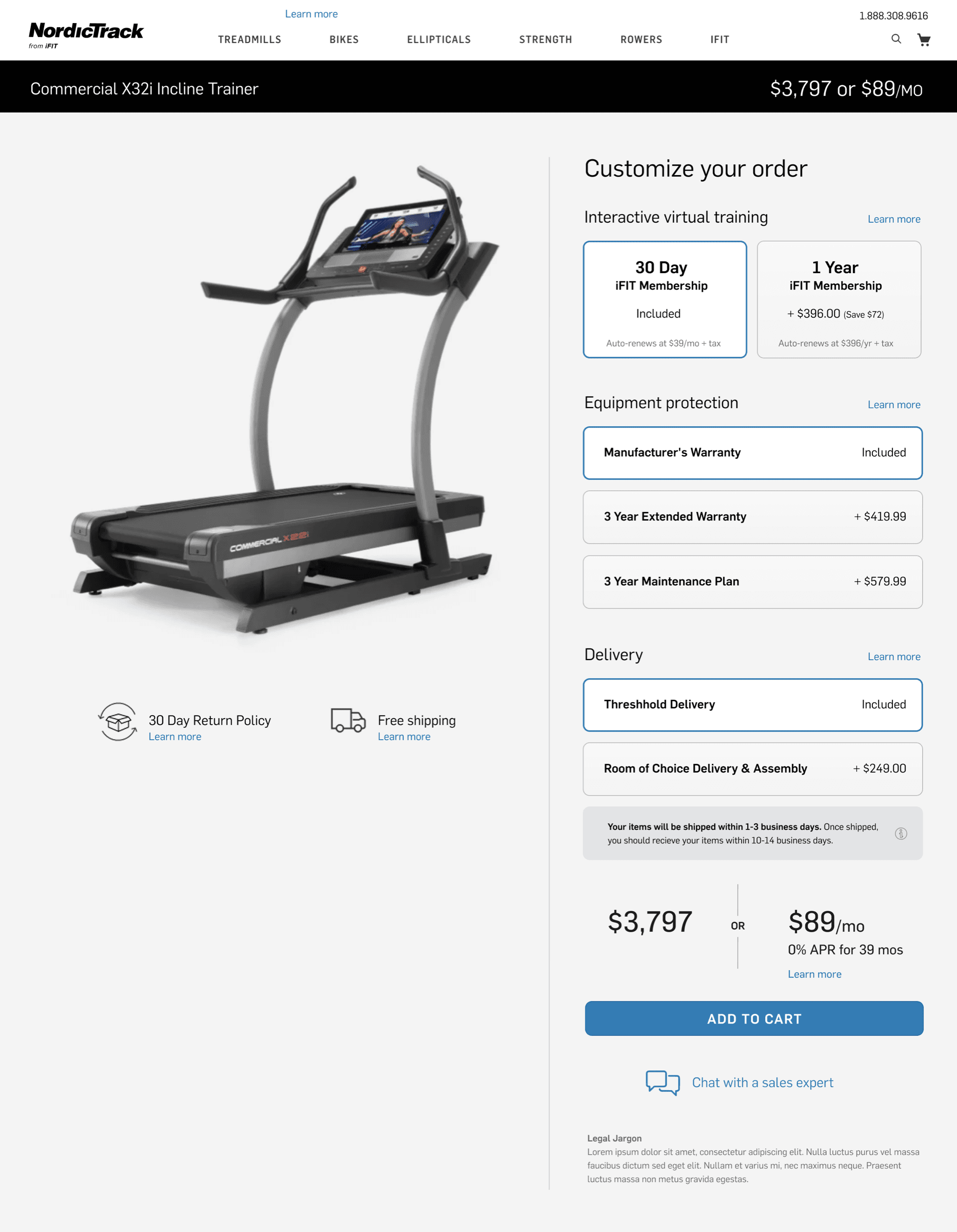
One page, not a wizard. The old cart was a multi-step form. The recommendation was a single page. Product on the left, configuration on the right, the treadmill in view the whole time you built it. Sounds obvious. It wasn't happening.
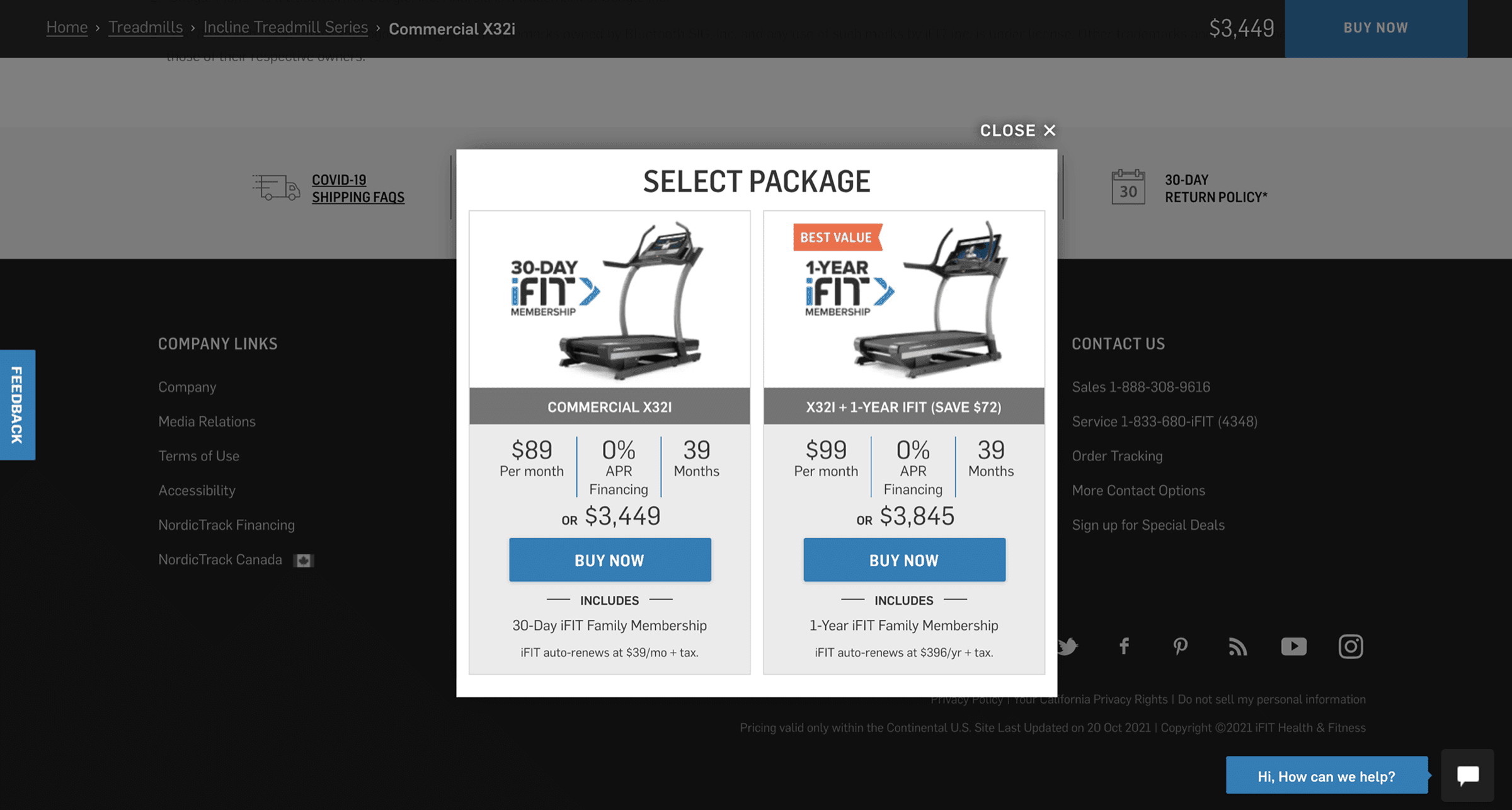
iFIT as a reason, not a gate. I moved iFIT out of the forced account-creation gate and into the cart as a selectable tier. 30 days included. A year added $324 and saved $72. Leadership's ask was blunt: make iFIT feel like a reason to buy the treadmill, not a stranger's add-on.
Answer the objection where it lives. Seven questions inline, under the configurator, instead of buried in a help center. Is a membership required? If I stop paying, can I still use my machine? How do I cancel? What's the warranty cover? The doubts that were quietly killing the sale got answered inside the sale.
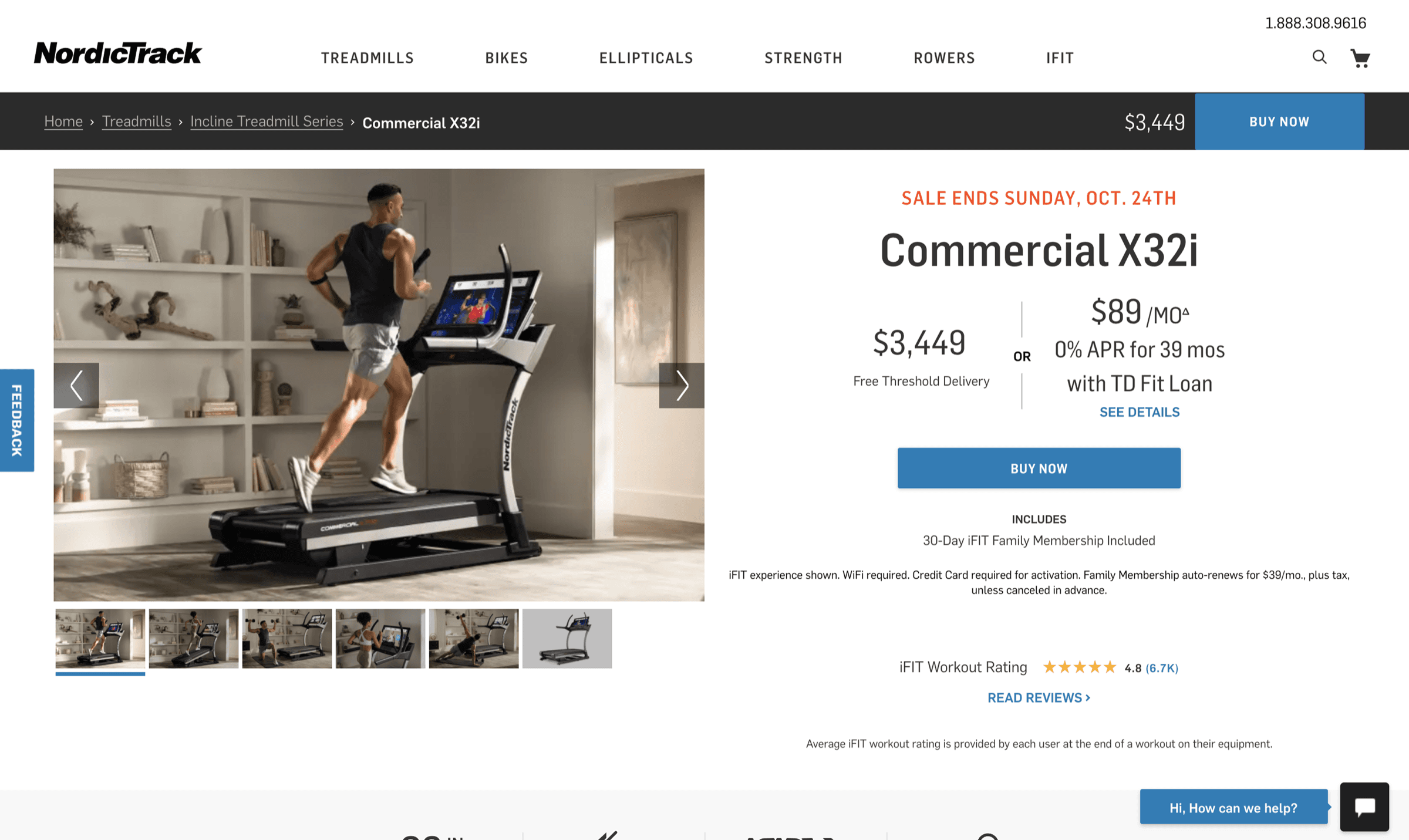
Show the real price. Every price read "$3,800 or $89/mo. 0% APR for 39 mos." together, not behind a "learn more." A $3,800 treadmill became a $90 decision.
Group the add-ons. Three clean comparisons instead of a flat upsell list. Training, protection, delivery. Every one priced out loud. Nothing hidden, nothing sprung at confirmation.
Bill on activation, not on order. The sharp one. The subscription clock doesn't start when the customer orders. It starts when they plug the machine in. One change killed four problems at once: delivery-delay anxiety, paying-before-using resentment, activation drop-off, and returns. The web checkout and the treadmill are one commercial system, not two.
The product page
Checkout shipped. The numbers came in. Leadership extended the brief.
The product pages still ran the old template. Generic e-commerce, a spec sheet, iFIT as one feature in a list. That contradicted everything the checkout redesign had just argued for.
So I redesigned the product line. Dark-mode brand motif. iFIT as the through-line, not a bullet. A full reshoot to match the price tag. The page stopped reading as e-commerce and started reading like a premium fitness brand.
The investor story
Eleven years at one company means a lot of work that isn't any single screen.
When iFIT pushed for its IPO, I did the S-1 documentation. Every investor deck. Every page that went in front of institutional investors deciding whether the company was worth billions. The job was taking the whole company story, growth, competition, future, and putting it in front of the most skeptical audience there is.
The offering didn't close. The IPO market collapsed in late 2021 and Peloton cratered the same year. That doesn't change the work. The exec team handed me the company's own narrative and trusted me with how it landed.


- The proposal that became NordicTrack's DTC redesign
- The 14-person creative team I hired and ran
- IPO documentation across all investor materials
- Design-system rebuild with an external agency
- Brand direction across photography, video, and packaging
What eleven years taught me
Stay somewhere eleven years and you stop caring about the individual screen. You start caring about whether the person leadership calls in a crisis is you.
I built the creative team from myself and two other people to fourteen. Twelve designers, two writers, across product, marketing, and social. I hired every role. And I ran it on one rule: you can't design workout software you've never sweated through. Everyone got iFIT equipment at home. Designers shadowed support calls so they heard the frustration firsthand. Real data in every mockup, never placeholder. Empathy wasn't a workshop. It was the operating condition.
The checkout is the piece I point to when someone wants a number attached. The real work was being the person leadership called when something was high-stakes, ambiguous, and couldn't fail.
People don't abandon carts because the form is long. They abandon the moment they stop believing the purchase was a good idea. You can't design your way to a shorter form and fix that. You have to design the belief.